What's new in 0.6.0
81 new icons in the latest batch.
Read the changelog00Pencil-style icons for the web
380+ pencil-style icons as SVG and React components. Each one is a few simple shapes that code draws like a pencil would: lines overshoot their ends, boxes cross at the corners and circles overlap where the pen closes. The same name always draws the same way, everywhere.
npm i @matita/icons
01Icons
Click an icon for its code. Size, stroke and colour are yours to change. Every icon also has its own page. See what's new in 0.6.0.
383 icons
No icon matches “”.
Request it on GitHub02Install
One package, four ways in. Icons inherit currentColor and are decorative unless you give them a title.
npm i @matita/iconsEvery icon is a component. SketchIcon takes a name and an optional seed; the provider sets defaults for a subtree.
import { ArrowRight, SketchIcon, SketchIconProvider } from '@matita/icons/react';

<ArrowRight size={20} color="#2748F5" />
<SketchIcon name="crosshair" pencil />
<SketchIconProvider size={24} strokeWidth={1.4}>…</SketchIconProvider>No framework needed. Render to a string, or create a DOM element.
import { Ruler, toSvg, createElement } from '@matita/icons';

toSvg(Ruler, { size: 24 });              // SVG string
document.body.append(createElement(Ruler, { size: 24, pencil: true }));Drop in placeholders and swap them in one call.
<i data-sketch-icon="ruler" data-size="24"></i>
<script src="https://cdn.jsdelivr.net/npm/@matita/icons/dist/umd/sketch-icons.min.js"></script>
<script>SketchIcons.replaceIcons({ icons: SketchIcons.icons });</script>Plain files for design tools, sprites and anything else.
@matita/icons/icons/<name>.svg     // ink
@matita/icons/pencil/<name>.svg    // pencil variant
@matita/icons/sprite.svg           // <symbol id="<name>">
@matita/icons/icons.json           // path data for every glyph
@matita/icons/pencil.css // paper grain for the pencil variant (dial: --matita-grain, 0 to 1)| Prop | Type | Default | What it does |
|---|---|---|---|
size | number | string | 16 | Width and height in px (or any CSS length). |
color | string | currentColor | Stroke colour. |
strokeWidth | number | 1.6 | Stroke width on the 24 grid. Every stroke scales with it. |
pencil | boolean | false | Pencil variant: every stroke drawn as two or three loose pencil lines. Pair with pencil.css for the paper grain. |
title | string | none | Accessible label. Without it the icon is aria-hidden. |
seed | number | 0 | SketchIcon only: a different drawing that always comes out the same for that seed. |
wobble | number | 1 | SketchIcon only: how much hand there is, from 0 (exact shapes: true lines, circles and corners) to 1 (the full drawing). |
03How it's drawn
Each glyph is a few drafting primitives on a 24 grid. A seeded hand turns them into pencil strokes, so the wobble is designed, not random.
| Code | Primitive | Arguments |
|---|---|---|
L | Line | x1 y1 x2 y2 |
P | Polyline | x y x y … |
Z | Closed shape | x y x y … |
R | Rectangle | x y w h |
C | Circle | cx cy r |
E | Ellipse | cx cy rx ry |
A | Arc | cx cy r a0 a1 |
Q | Curve | x1 y1 cx cy x2 y2 |
O | Dot | cx cy |
R 3.5 5 17 14;
C 9 10 1.6;
P 3.8 17 9.5 12.5 13 15.5 16 13 20.2 16.8Same name, same seed, same drawing: in SVG, React and the browser, on every machine. Change the seed for another take.
04Pencil variant
Pass pencil and every stroke is drawn as two or three loose pencil lines, like a quick sketch. Import pencil.css once for the paper grain, and set --matita-grain from 0 (solid lines) to 1 (full grain) to dial it.
import '@matita/icons/pencil.css';
import { Ruler } from '@matita/icons/react';

<Ruler size={32} pencil />05Follow along
New icons land in regular releases. See what just arrived, what is being built next, and how the pencil hand works.
81 new icons in the latest batch.
Read the changelogMatita stores recipes, not drawings: a few shapes on a grid that a small program draws like a pencil. The same name always draws the same way.
How it works, step by step06Used in
Libraries and projects that ship Matita. Using it somewhere? Open an issue or write to hello@matita.dev and it can be listed here.
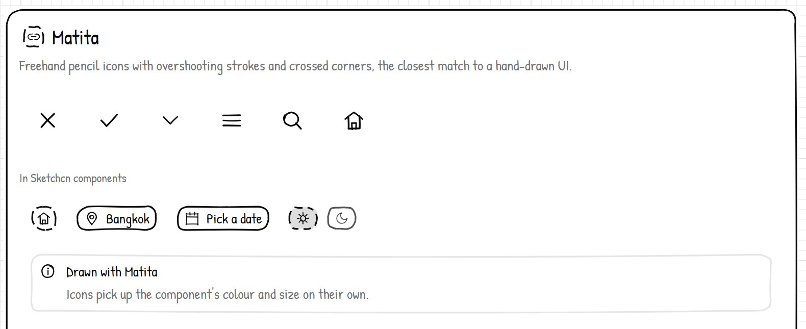
A registry of hand-drawn React components in the shadcn style. Since 0.2.0 its Button, Checkbox, Dialog, Native Select, Sheet, Sidebar and Toast use Matita for their icons, and its docs have an icons page with install steps.